
How to Create Wedding Invitation Photos with Space for Text?How to Create Wedding Invitation Photos with Space for Text?
Most invitation portrait failures happen at the composition stage — a beautiful couple portrait with no room left for names, dates, or venue. FondPix AI portrait generator creates portraits specifically designed with negative space: sky above, soft background left or right, or centered couple with breathing room on all sides. The goal is a portrait where the couple is the emotional center and the text has a natural, uncrowded place to live alongside them.Most invitation portrait failures happen at the composition stage — a beautiful couple portrait with no room left for names, dates, or venue. FondPix AI portrait generator creates portraits specifically designed with negative space: sky above, soft background left or right, or centered couple with breathing room on all sides. The goal is a portrait where the couple is the emotional center and the text has a natural, uncrowded place to live alongside them.
emotion first
couple likeness
wedding use
How to Create Wedding Invitation Photos with Space for Text?
This guide covers the composition rules, negative space techniques, and output settings that make AI photos print-ready for invitation overlays.
Best for couples who want more than a pretty sample
- Couples who have tried using portrait photos for invitations and found that there was nowhere clean to place the text without covering someone's face.
- Partners who are working with a designer or creating invitations in Canva and need a portrait that has intentional open areas for text overlay.
- Anyone who wants both an emotionally compelling couple portrait and a practical invitation layout — not choosing between the two.
What to check before choosing
- Emotional goal
- create an invitation portrait with deliberate open space so names and dates can live alongside the couple without competing
- Where to use it
- clean minimal, invitation portrait, and romantic garden for wedding planning, design, or keepsake decisions.
- Check closely
- Review likeness, closeness, hands, wardrobe, crop, text space, and whether the image feels tender.
- Real boundary
- Use AI for previews and design; keep vows, family groups, hugs, and guest reactions as real photography.
How to Create Wedding Invitation Photos with Space for Text?+
Most invitation portrait failures happen at the composition stage — a beautiful couple portrait with no room left for names, dates, or venue. FondPix AI portrait generator creates portraits specifically designed with negative space: sky above, soft background left or right, or centered couple with breathing room on all sides. The goal is a portrait where the couple is the emotional center and the text has a natural, uncrowded place to live alongside them.
Which version should we try first?+
Start with clean minimal, then compare it with invitation portrait and romantic garden. The first round should reveal feeling, not create too many similar images.
How do we know it fits us?+
Look beyond polish. Check whether both people still look like themselves, whether the expression feels relaxed, and whether the image supports the real wedding use.
Try these moods first
Warmer directions for How to Create Wedding Invitation Photos with Space for Text?
These directions are chosen to help you give invitations and save-the-date pieces a warm couple image before the final gallery exists. Compare how each one changes closeness, formality, layout space, and the way family or guests may receive the image.
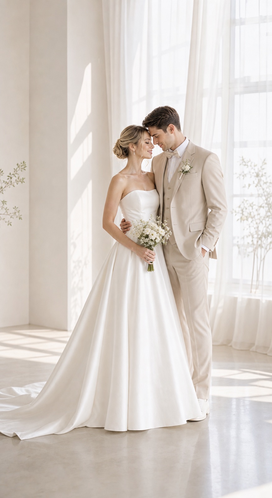
clean minimal
Open background and breathing room — this direction is specifically built for stationery designers to add text.
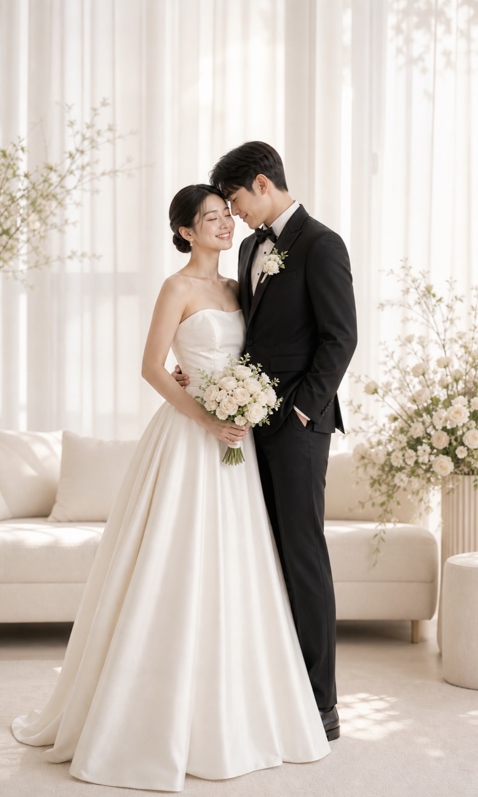
invitation portrait
Compare the portrait version — soft tone and centered framing still leave enough edge for names and dates.
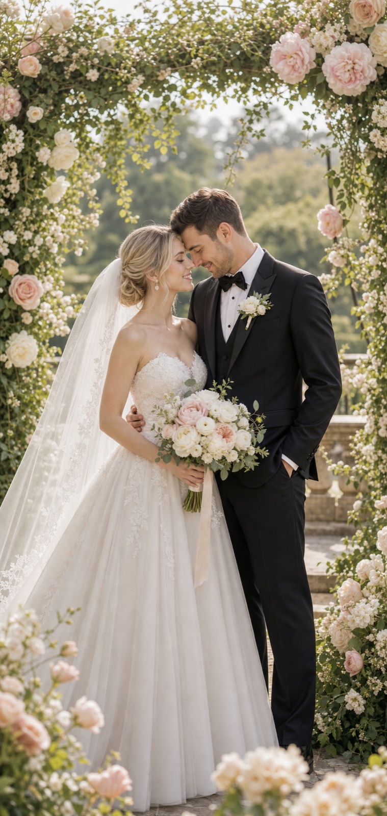
romantic garden
Share the garden version with your designer — some invitation layouts benefit from an organic layered border.
Try these moods first
How FondPix helps with How to Create Wedding Invitation Photos with Space for Text?
Move from emotion to decision: upload photos you both like, test a few clear directions, then keep the one that supports the next wedding step.
Start with photos you both approve
Use clear, natural couple photos where both faces, posture, and expression feel like you.
Name the wedding feeling
Compare clean minimal, invitation portrait, and romantic garden by warmth, formality, family fit, and design space.
Receive Two Wedding Portraits to Compare
FondPix creates two high-quality watermarked previews so you can see both portraits before deciding whether to keep them. If neither portrait feels right, you can leave the project unpaid. A one-time payment keeps these same two high-quality files without watermarks; it never creates replacement images.
Where this can improve the wedding experience
FondPix is most valuable before a decision becomes expensive, public, or hard to change.
clean minimal
clean minimal helps you judge the image from a different angle: warmth, likeness, family fit, and real wedding use.
invitation portrait
invitation portrait helps you judge the image from a different angle: warmth, likeness, family fit, and real wedding use.
romantic garden
romantic garden helps you judge the image from a different angle: warmth, likeness, family fit, and real wedding use.
Couple decision guide
Keep the real memories real
Use FondPix for planning, previews, invitations, album ideas, and briefs. Use real photography for vows, family groups, guest reactions, and one-time ceremony moments.
How do we know it fits us?
Look beyond polish. Check whether both people still look like themselves, whether the expression feels relaxed, and whether the image supports the real wedding use.
See both portraits, then choose what they are worth to you
FondPix creates two high-quality watermarked previews so you can see both portraits before deciding whether to keep them. If neither portrait feels right, you can leave the project unpaid. A one-time payment keeps these same two high-quality files without watermarks; it never creates replacement images.
Can FondPix replace real wedding photography?
No. Use FondPix for planning, invitations, albums, moodboards, and briefs. Keep vows, family moments, guest reactions, and ceremony memories as real photography.
How to Create Wedding Invitation Photos with Space for Text? FAQ
Short answers for couples who care about emotion, trust, image quality, and real wedding boundaries.
What composition style creates the most text-friendly invitation portrait?+
Centered couple with clear negative space above (sky, soft ceiling, or blurred foliage) is the most reliable composition for text placement. Left-aligned or right-aligned couple with a clean background on the opposite side also works very well. The key is that the background area designated for text should be uniform in tone — very light, very dark, or softly blurred — so the text reads clearly without contrast issues.
How much space should I leave for invitation text?+
For a standard invitation layout, one third of the image width is usually sufficient for names, date, and venue in a comfortable font size. Generate the portrait and then test the layout in Canva or your design software before finalizing — what looks like enough space in the portrait sometimes shrinks when text is actually placed.
What background colors work best behind invitation text?+
Pale, warm backgrounds — cream, very light sage, soft ivory — are easiest to read text against. Deep navy and dark forest green can also work if the text is white or gold. Avoid mid-tone backgrounds that are neither light nor dark — they create contrast problems for almost every text color.
Can FondPix replace real wedding photography?+
No. Use FondPix for planning, invitations, albums, moodboards, and briefs. Keep vows, family moments, guest reactions, and ceremony memories as real photography.
Create a wedding image that feels like you
If these wedding portraits give you even a moment of feeling, choose the price that feels right and keep them both as part of your story.
Upload clear couple photos and compare clean minimal, invitation portrait, and romantic garden before you use the image for the wedding.